Symantec PKI and Web Security product overhaul
Project boxscore
Position Led team of 10 designers and writers. Contributed to or led all design work. Mentored junior designers. Worked with research team, and conducted my own research sessions. Collaborated with visual design team for pixel perfect designs.
Duration 2 years
Tools


Team composition
30
Developers
2
Product managers
4
User Interface Developers
5
Visual and UX designers
7
QA engineers
4
Content writers
3
User experience researchers
Rundown
Background
I worked in the Website Security business unit at Symantec (since acquired by DigiCert) where I was the enterprise product lead for User Experience.
Symantec had two major enterprise offerings, (both dealt with SSL certificates, which secure most web transactions) MPKI for SSL (MPKI) and Certificate Intelligence Center (CIC). The main use cases for MPKI for SSL were companies requiring large number of certificates and issuance by multiple administrators across orgs or business units. Certificate Intelligence Center was geared more towards inventory management, and automating certificate installation. The platforms overlapped in certain areas, but you had to use two separate consoles with distinctly different experiences to leverage the full potential of the Symantec product suite.
The project
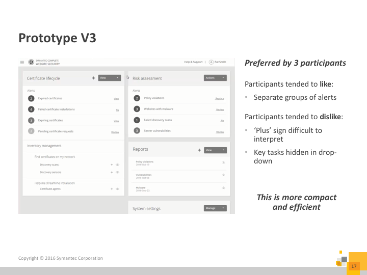
The business unit needed to consolidate the products to offer a better overall experience for customers. One of the first teams to start on this project was sales, who started selling a solution called Complete Website Security (CWS) in 2016. In the early stages of this offering, it was simply a bundle of the existing products which Symantec offered. As the enterprise lead, I led the charge from the experience side (and helped with some of the marketing) to combine the two products into one new product! Version 1.0 of CWS went out the door on August 25th, 2017, over a year after we started!


Requirement gathering and setting scope
I worked with the Product Managers for both MPKI and CIC to determine what the scope of the project would be. I advocated for features which the UX team felt would benefit our users the most. To help guide our decisions we leveraged customer feedback from previous user studies, as well as our internal backlog of issues.
Goals:
- One cohesive product
- While we were in a position to completely redesign some existing screens, and create new ones, we didn’t have the time to do this everywhere, so we had to identify the pages where we could simply update the look at feel so the experience across the product was cohesive and consistent
- We also had to ID where there was overlap, and how to best combine the features of both products to take advantage of existing strengths
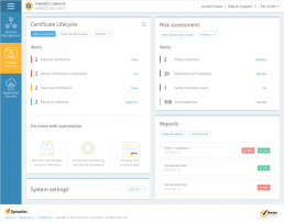
- Make landing (internally called Wall or Dashboard) page more actionable
- Based on customer feedback we knew that the existing tools were not designed optimally to fit workflows
- We emphasized task based workflows, which meant surfacing items that required user attention on the product landing page to allow for action to be taken from there
- Simplify product
- CIC and MPKI both had persistent navigation (which was often unrelated to the user’s current task) along with outdated designs, which resulted in a lack of clear focus on any given page, we worked to reduce on-page distractions
- Seamless integration
- There were many features which either worked together between the two products, or overlapped, so we had to make sure everything was put together in an intuitive way
Setting the scope
During this project we were really working in a waterfall development methodology, but the actual UX team was delivering and scheduling milestones in sprints. Once the high level requirements were done, my team and I combed through all the existing screens, (a quick “discovery” phase) and noted where things might need changes.
Once this was done, I led the team in a pointing poker session where we all voted on how many points we thought each project would take, this allowed us to accurately scope the work. Next I created and maintained a schedule with deliverable due dates and milestones for the team, along with tracking a JIRA agile Kanban style board to ensure everyone was on track, and assisted any team members when there was a need.

User stories
The next step was to write all the user stories for any user action. Since this project was so large, different designers were assigned to different stories (which was common for most of the work on this project). I focused on the largest, and most complex stories and helped to review, and set direction for other stories which I didn’t directly write. We based the stories on a set of personas which we already had from previous research. Stories were also prioritized based on how important they were going to be to our users (again, from prior conversations with clients). This helped us to understand and inform some user goals, as well as the information architecture.

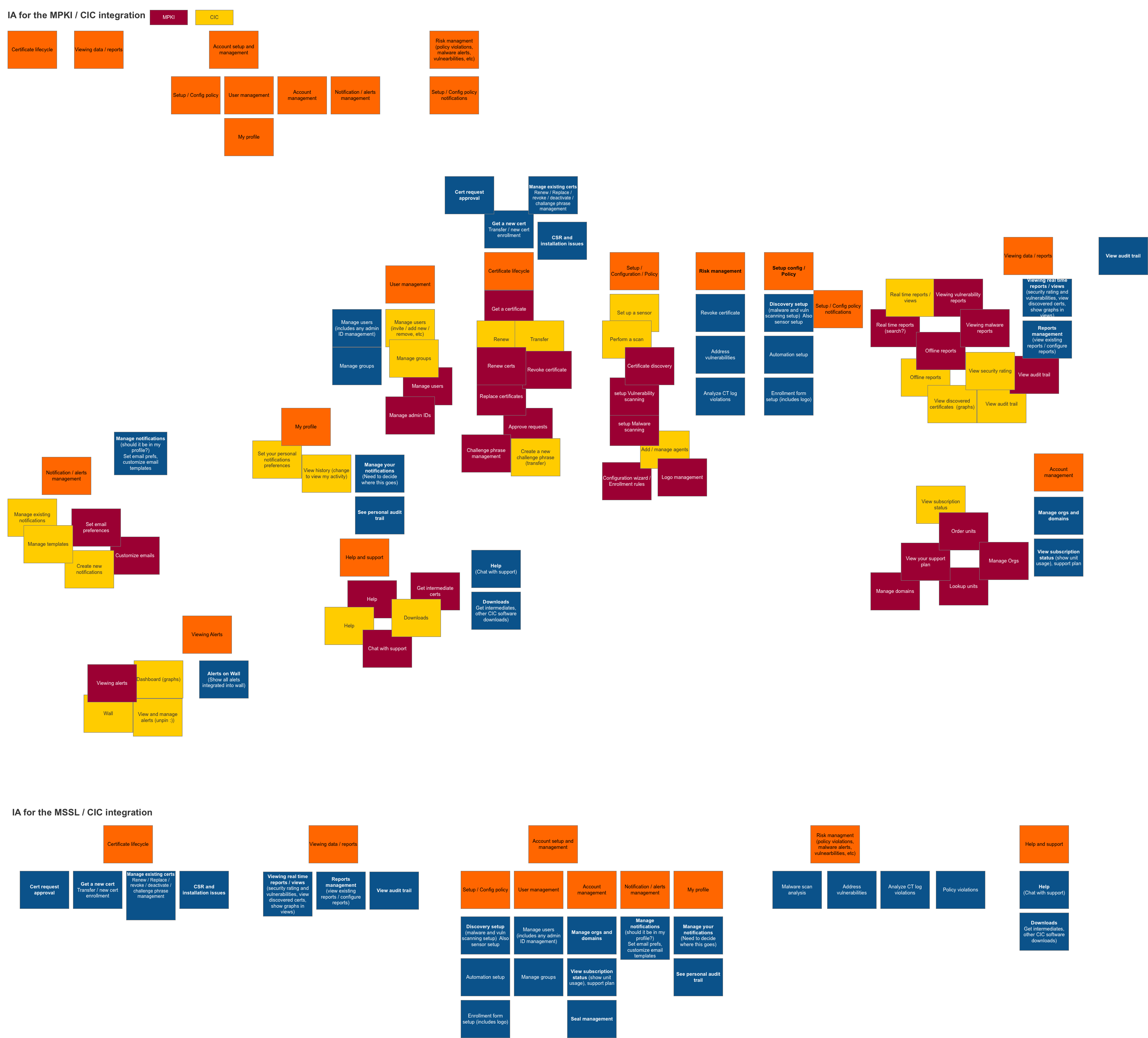
Information Architecture
After the user stories were all written, I led a deep dive into the information architecture of the new product. The whiteboard is often where the magic happens, and it’s where the IA was started. I followed up with some affinity diagramming – I jotted down all the features onto sticky notes, and then organized them into the most logical groupings.
Once I was satisfied with the organization (and did some iterations based on UX team feedback), I formalized things digitally so that we could collect feedback from our users.

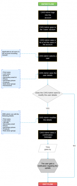
User flows
The next step in our process was documenting all the user flows. We made flows for every user story in phase 1. These went through several iterations, and were a very good starting point before we starting getting into the user interface.
Click the image below to view some of the flows for our user management section.
Password: final-specs
Wireframes
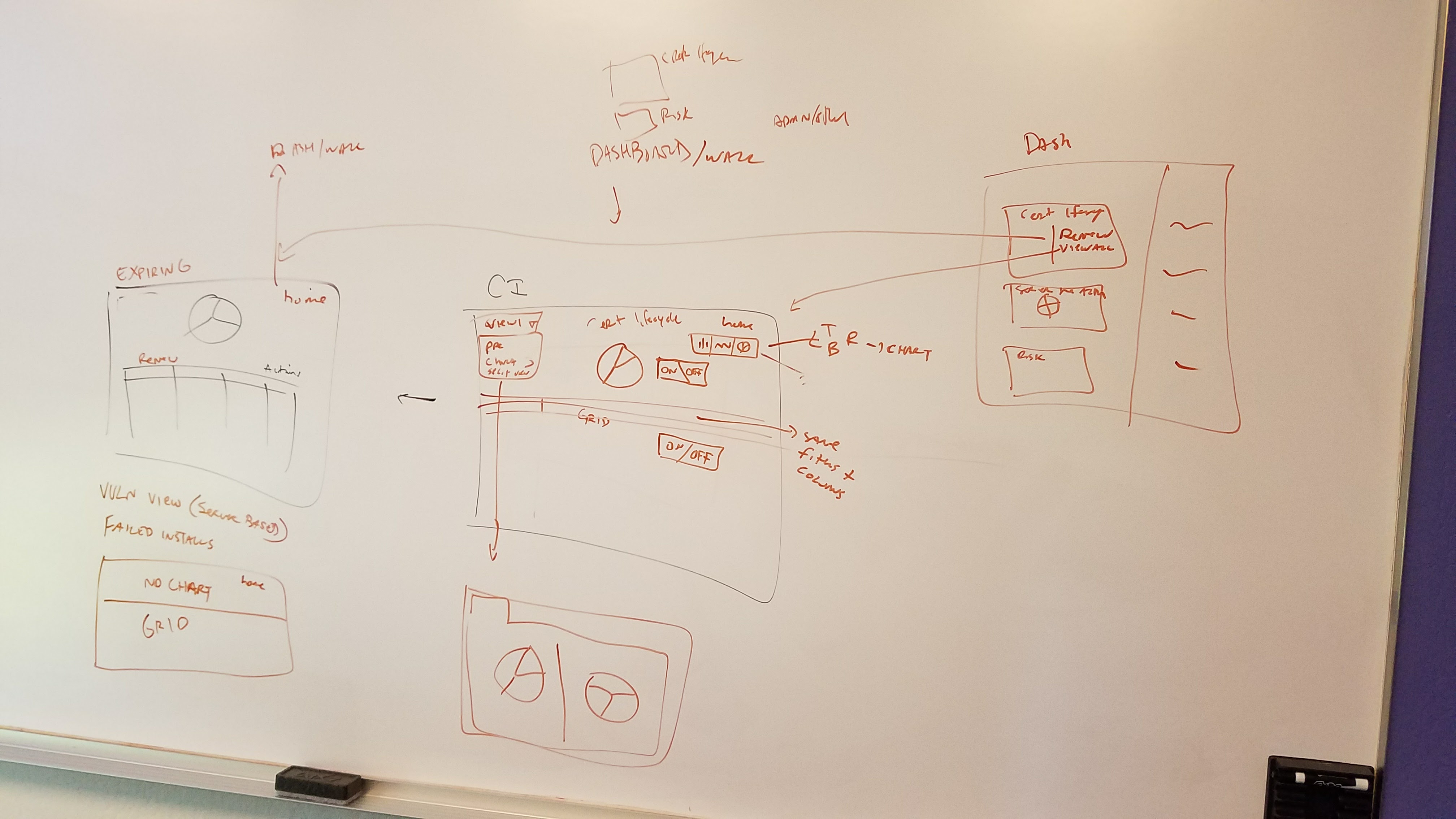
Now that we had an idea of where things would go, who needed what, and how tasks would be accomplished, it was time to start working on the screens.
My design work usually starts – you guessed it – with a whiteboard and at least 2 or 3 colored markers. In this case, I utilized whiteboards all over the office, in conference rooms, on the door of my cube, anywhere with a whiteboard surface was fair game!
Once we were satisfied with the whiteboard concepts, I went to work digitizing everything into our tool of choice at Symantec (Axure). Next we went through several iterations, and then started to put together some concepts for user testing.
User testing round 1
In parallel with the wireframes, I was leading several 2 interaction designers and providing feedback to 2 visual designers for a brand new style guide. We took the wireframes, applied early stage visual design concepts, and created a very basic prototype to test both visual and interaction concepts.
Participant overview
- Tested Small and medium businesses, and enterprises
- I was focused on enterprise – details below are specifically from the enterprise testing
- Tested with 8 participants
- Org size ranged from 1000 – 10,000 people
- Number of certificates managed ranged from 25 – 1000
- All were users of either MPKI or CIC
Study tasks
We had participants perform 6 common tasks in CIC and in the new CWS prototype. The order was randomized per participant.

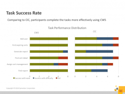
Study findings
Overall participants preferred the new CWS style guide early stage concepts vs the existing CIC product. I’ve included several important graphics indicating a reduction in time on task, and a better task success rate for the new style guide. We also had users rank their satisfaction using the System Usability Scale (SUS). You’ll have to head to the end of this project as the results were so impactful I stashed them there!
“This is self explanatory and easy to use!”
-User study participant

Iterate wireframes and start visual design
With the results of our study in tow, along with feedback from team reviews baked into the design process we set out to improve the designs. For the purposes of this case study I’m going to keep things simple, but in many cases there were several rounds of iteration on given screens.
It was around this same time that we also identified new screens for CWS which might not be defined in the style guide, and started to work with the visual designers to define the details for each screen.
User testing round 2
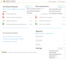
After we iterated on the designs, we put together another set for testing. This round we focused more on the dashboard, since it was the page every user landed on when they used the application.
Participant overview
- Tested Small and medium businesses, and enterprises
- I was focused on enterprise – details below are specifically from the enterprise testing
- Tested with 8 participants
- Org size ranged from 100 – 10,000+ people
- Number of certificates managed ranged from around 30 – 8000+
- All were users of MPKI
Study tasks
We had participants perform 4 common tasks on 3 different variations of the CWS dashboard to get a sense of whether they preferred things like:
- Icons with and without descriptive text
- Showing all available actions on screen vs placing actions in a menu
- Showing some primary actions and using a menu for secondary tasks
- Organization of information – one long alerts list vs alerts grouped by type
We also collected feedback on visual preference between 3 separate designs.

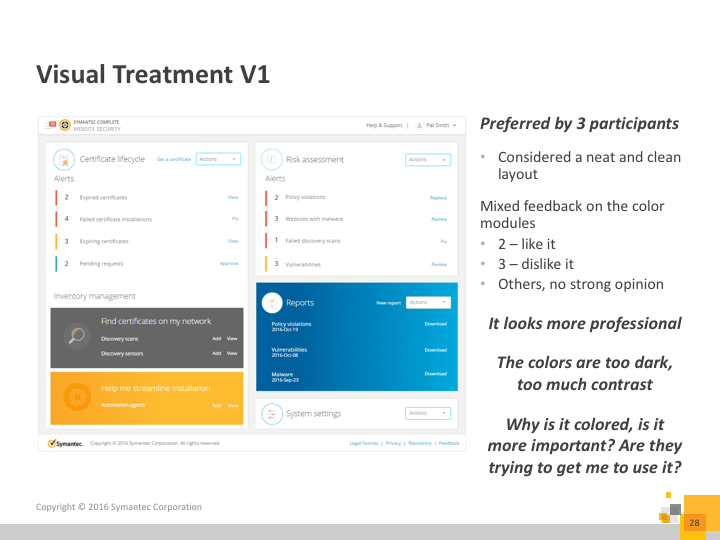
Study findings
- Participants wanted their core tasks to be visible, not inside a menu
- Participants preferred their alerts to be separated by alert type (opposed to a list of all alerts)
- Icons with text were preferred to just icons alone
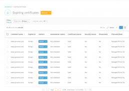
Final recommendations
After compiling and assessing all the results from the second round of testing we updated and reviewed designs. We handed everything off in Axure files, including visual design, and a style guide (which we made a internal website for).
The approach for the specifications was as follows:
- All visual and interaction specifications were in the style guide
- Page specifics were defined in the wireframes
- Button names, primary / secondary designation and destination when clicked
- Alert types, names, priority, and destination
- Links to other parts of the application along with required permissions to allow the user access
This approach was used to reduce redundant specifications from the UX team, and minimize confusion about screen specifics. Things like the notes about going to other pages to view certain specifications, was to ensure that the engineers along with QA could always see the latest, updated specification, and UX didn’t need to update it in multiple places.
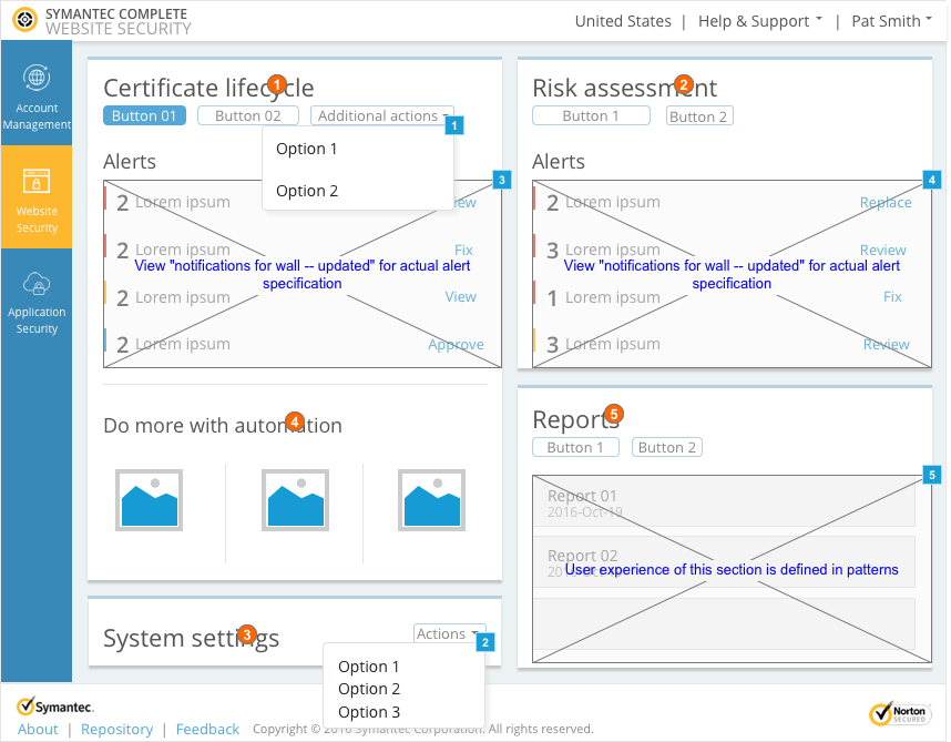
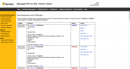
Click here to view to some of the interaction specs for the dashboard that I worked on for this project.
Password: final-specs
There are many other specifications for this uber-complex project. If you’re interested in hearing more, reach out to me.
After handoff
After handoff UX team members were responsible for working with QA and engineering to insure that that designs they worked on were implemented as per the spec. I also personally collaborated with marketing to ensure that our emails, fact sheets, and promo videos, contained accurate information, and made sure the proper hi-fi screens were included in all these materials.
I also worked with our support team to understand the most common issues both new, and migrating customers were facing. To combat this I wrote scripts for videos (which the support team put together) to help ease these frequent issues customers ran into. Along with that we created additional in product guidance for our migrating customers.
Project outcome
Based on our research the CWS console received a System Usability Scale score of 90, which is extremely good! Since the launch in 2017 we’ve been continually improving based on customer feedback and internal roadmap milestones.
“Awesome. Thank you fellas! This really has been an excellent change, and I am very happy with the new interface.”
-CWS user
63
percent increase in SUS score vs CIC
16
percent increase in SUS score vs MPKI