Certificate Transparency log monitoring feature
Project boxscore
Position Did the all the design and experience work including visuals. Also used analytics data to drive design updates and worked with research team to collect feedback from users.
Duration 4 months
Tools


Rundown
Project overview
We heard from users that our premium SSL certificate offering needed more value added features to justify the higher cost. DigiCert partnered with a third party service which monitored activity in the Certificate Transparency logs, which would be a service included with the purchase of our premium product line. I lead the project to figure out the best and most valuable way to implement this service into our product.
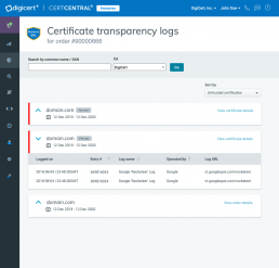
What are Certificate Transparency logs?
The Certificate Transparency logs is an initiative launched by google in 2013. At a high level when a certificate is issued, it is added to a centralized log, which anyone can audit. The idea is that if all the logs can be audited by anyone it will make things more secure and transparent
Initial discovery
Something I like to do at the beginning of a project which involves adding a new feature into an existing product is conduct an initial discovery of the existing product. Basically I go through the product and annotate screenshots of potential areas of impact.
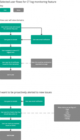
User flows
After I looked at the product to determine where the best fit for the features would be I started creating some user flows. The main persona for this project is a network administrator who puts a high premium on the best security.
I’ve added 2 of the core user flows below:
- How a user will view domains
- Proactive alerting users to any issues
Project impediments
One of the drivers for this feature was a business goal of improving our premium product offering.
Due to this the product manager and execs wanted to get this feature out fast, utilizing a minimum viable product (MVP) type approach.
- This meant that my vision for the future facing designs would be pushed out much further
- I documented the more in-depth user friendly updates in our issue tracking system (JIRA) to be added in future sprints
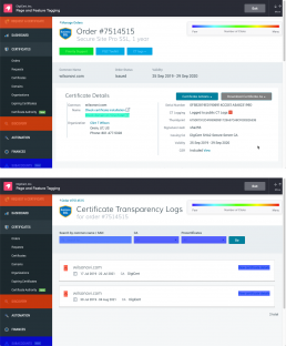
MVP scoped initial wireframes
Once the scope was more concretely set I put together an initial set of MVP based wireframes.
The concept below shows:
- Keeping the data in the main pane of the certificate order via tabs
- Allowing the user to see at a glance if there are any issues via alerts on each tab
- On an SSL certificate you have what’s call a multi-domain or wildcard certificate which can protect multiple domains / subdomains under one certificate
- User can click to view the subdomains per san without leaving the page
The SAN1 box is interactive and expands and collapses on click — try it out!

Iterated version of wireframes
I iterated the concept shown above to align more closely with the product requirements and level of effort for the engineering team.
The concept below is closer to what the final product ended up being. Basically the idea here is to just show each domain separate, instead of trying to group them. I also proposed having the enable / disable controls on the top bar here, mainly because I wanted it to be easy to discover.
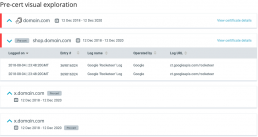
Pre-cert indicator visual exploration
An option that I wanted to show on this page was whether the entry in the logs was a ‘pre-certificate’
- Many times the certificate authority submits to the CT log before it issues a certificate, and then actually issues the certificate, so it’s possible there will be a pre-cert entry without the certificate actually being issued
- You can see why this would be important to show customers — Here’s some visual exploration I did on how this might be displayed
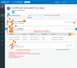
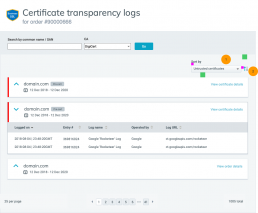
1.0 Wireframes
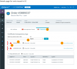
After some more iteration and design reviews and collaboration with stakeholders and engineering I delivered the final wireframes.
- You’ll notice here on this page that I moved the on / off control into a button and included a link to view the actual logs in there as well
- The original design I proposed with the results in tabs ended up not being feasible within the scope of this release, so I looked at the end state I wanted to get to, and ended up proposing the design you’re seeing here where the you can view the details of the logs on a new page. I believe this will allow for future flexibility and is in the general direction I want to overall design and feature to go
- It was also around this time that I started utilizing the “low fidelity” feature in axure which makes your wireframes appear less visually polished, so it’s clear what’s a visual and what’s a wireframe
Visual specifications
I also put together a visual specification for this feature as the components were new to the product.
Post implementation analysis and follow-ups
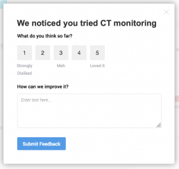
After the new feature was added to the product I worked with the research team to add an in-app poll to gather initial feedback.
The poll was shown after the person access the feature for the second time, with the idea being that they were able to get some experience with it before we prompted for feedback.
Users generally wanted:
- Sorting
- Notification management
- Ability to filter by specific Certificate authorities
Another thing I did was learn how to tag all the major functional areas of the feature in our analytics tracking tool.
One of the more illuminating data points was this heatmap. You can see that the CT log feature is one of the least clicked on the page.
I also checked on the actual CT logs details page, here you can see the most clicked item within the page is the expand chevron, followed by the search filter.
To me this means the following:
- We need to do a better job of driving people to this feature, I have been exploring design options that would not only highlight this feature but other features on our premium product offerings.
- Filtering by pre-certificates doesn’t seem to be getting used frequently
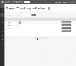
2.0 wireframes
One of the initial proposals from the product manager based on customer feedback was actually for a “CA whitelist”.
I changed the concept to be more focused on notifications to be more easily understood and relatable to our users.
- The final wireframe shows the iterated design where the user can mark a CA as trusted (which prevents the console from flagging it) and disable email notifications by specific CA
- A user can manage notifications for all CAs from this page
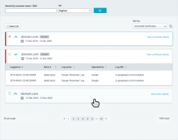
Click the image below to view the initial specification along with the final iterated version (scroll down view).
Visuals and style guide additions
- Here’s the final visual specification I put together for adding a sort to the UI
- Another UX enhancement shown in the specs is an update I made to the CA filter based on user feedback – this allows the user to sort by specific CA or DigiCert v non DigiCert (click the image below to view the full spec)
Another responsibility of mine is to ensure consistency and clarity in the product. Below is a specification I used in the product style guide. One notable thing is that in this mock I’m showing the bulk selection UX option, which is one reason why there’s a blank space there in the original design.
Post 2.0
After the 2.0 changes were implemented I’ve been continuing to monitor the analytics and on the lookout for any trends and customer feedback via our in app polling.