Updated automation alerting UX
Project boxscore
Position Did the all the design and experience work including visuals. Also used analytics data to drive design updates and worked with research team to collect feedback from users.
Duration 3 months
Tools


Rundown
Project background and overview
The project was to migrate and optimize our certificate automation features into our core platform. I led the project from the UX side and utilized previous research and customer feedback to improve on the old toolset.
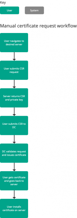
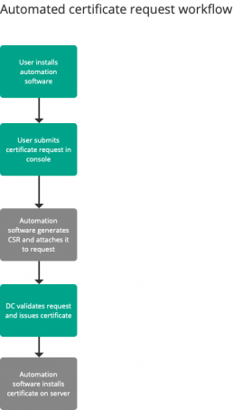
What is certificate automation?
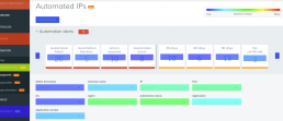
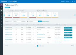
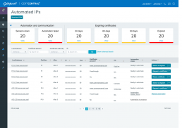
Main page for automation management
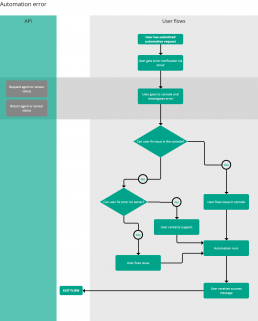
User flows
After I looked at the product to determine where the best fit for the features would be I started creating some user flows. The main persona for this project is a network administrator who wants to streamline their certificate management process.
I’ve added one of the main flows this project is focused on below, which is an automation error flow. For these flows I also tried to map out high level impact on the underlying API as well.
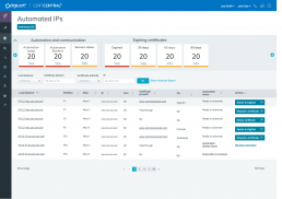
Wireframes and iteration
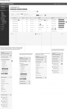
Below I’ve added an initial wireframe I put together for this project:
- This early wireframe is focused on the different interactions a user might want to do from this page
- There are dynamic state based buttons recommending the most appropriate action
- I’ve defined how these buttons should function and the different states (click image to view)
- Status column – if any of these are in error state the user will need to take action to fix them
- The idea I want to convey here is that there are a lot of things on this page that need the users’s attention
- You’ll also notice the style of these wireframes is more low fidelity, I’ve done that on purpose based on some of my previous experiences with engineering where they’d mistake wireframes for end state visuals
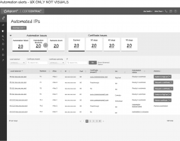
Iterated alert based wireframes
As evidenced by the previous wireframe, there are a lot of different areas for the user to focus on for automation. The next set of wireframes I put together was to help mitigate this.
These concepts focus on alerting and workflow. You’ll notice the image below is showing alerts all stacked on top of each other at the top of the page, that’s how we were handling notifications in the application. Feedback from users during previous studies of the product was that this was difficult to map priority and was taking up a lot of space on their working view. What I wanted to do is allow users to have an efficient way to see all their tasks and get into the right workflows and address any issues that need their attention.
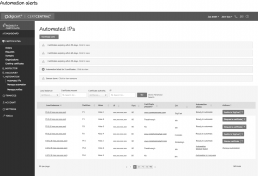
Here are several of my early iterations for improving the way this was handled.
Some goals:
- Minimize footprint
- Help user prioritize issues and support workflows
- First one is trying to use simple categories
- Second one is more of a dashboard style
Visual iterations
Once I did some iteration on the wireframes and started getting to a more final state, I also started exploring some visual designs for how the notifications might end up looking / working.
This page you can see my general direction starting to take shape. This was an overly simplistic version, I was trying to keep the names of each card on one line here, but it also limited the amount shown on screen.
This is closer to the final version, it allows the user to see more alerts on screen at one time and is a bit more of a scalable design.
Final wireframes
After some more iteration and design reviews and collaboration with stakeholders and engineering I delivered the final wireframes.
- These wireframes are more for the high level general overview of the feature
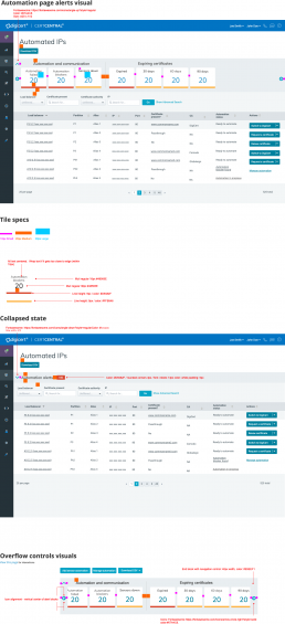
- Shows expanded and collapsed states of the alerts panel
- You’ll notice that when the panel is collapsed an overall alerts badge is shown so users can still see how many alerts they have regardless of the panel state
UX overflow spec gif
When there is a need for interactive specifications, one trick I use is to prototype an interactive version of the design, and then record myself using it and export that as a gif as a supplement to the specifications I hand off to engineering.
Below you can see a specification I created for the overflow UX for the alerts pane.

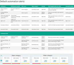
Notifications specification
Another specification I put together was this table of what all the alerts should be, how they should be organized and what should happen when you click them.
Final visuals
Here’s the final visual spec I put together.
You can also see and additional visual iteration where I removed the “view” link and made the numbers themselves clickable.
Post implementation analysis
After the feature went live I went to the analytics to get insights about usage and user behavior:
- I tagged all the major functional areas of the feature in our analytics tracking tool
- Right now I think the information around clicks on the alerts is too preliminary to draw any real conclusions due to the initial user ramp up period
- This does give me a good sense of what filters on the page are the most important and I’ve recommended some reorganization to put those at the top of the page.