Website Security application style guide and design patterns
Project boxscore
Position Project lead – mentored junior designers, set and tracked milestones and deadlines. Worked on interaction patterns.
Duration 1 year
Tools


Team composition
5
Visual and UX designers
4
User Interface Developers
3
Content writers
Rundown
Symantec’s security product portfolio was in dire need of rebranding. The major products felt dated and lacked conventions seen in modern applications. In part, spurred on by the PKI overhaul project a need was identified to create a brand new modern style guide for Symantec’s product portfolio.
Project vision and goals
As the design pattern project lead I worked with the UX director to drive the direction of the guide.
Some of our goals included:
- Task based design – many of our users infrequently visit our consoles, when they do they want to get their tasks completed quickly
- Maximize use of screen real estate – don’t leave objects on the page that aren’t immediately relevant to the user’s task
- Scalable design – the patterns needed to support our single customer all the way up to large enterprises
- Be consistent – but not at the expense of usability
Competitive analysis
When the project started, I was leading the design for some of the patterns, such as data tables, and their toolbar and filter conventions. Another responsibility I had was to define the core of the workflows of the product, which you can read about in more depth later in this project. The first thing I did was look at existing style guides created for other applications.
Some of the guides I reviewed were:
I circulated these and reviewed other guides with my team members.

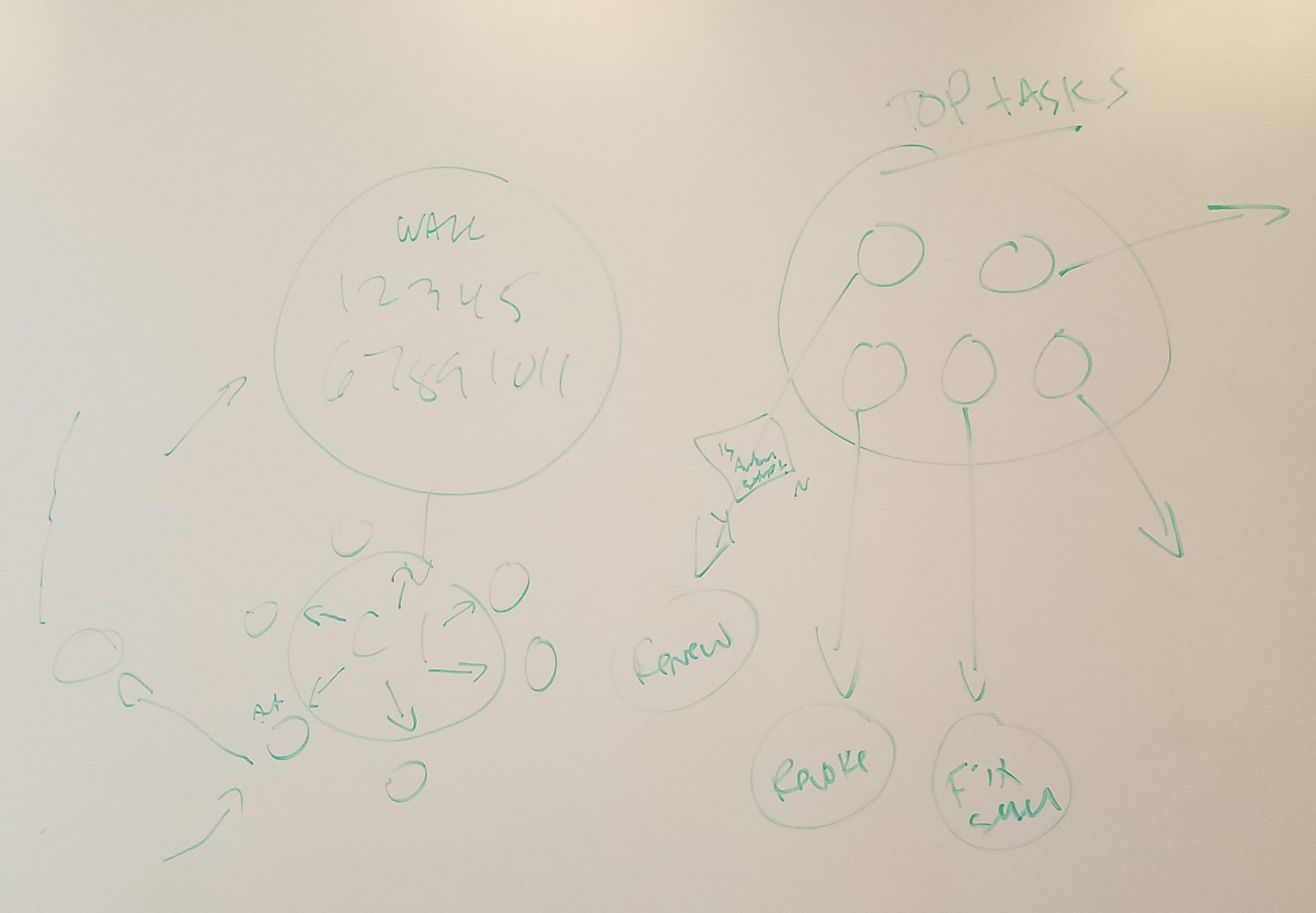
Defining workflow architecture
After the competitive analysis I started (you guessed it) white-boarding some ideas for the core workflow architecture of the style guide.
Following the goals stated above, we needed to build a scalable interface while maintaining user focus by reducing unnecessary on screen elements. We also had to build a task based paradigm to facilitate our user’s workflows. The whiteboard session shown here was my first shot at defining the task based workflow, where all the major issues are surfaced on the dashboard page.
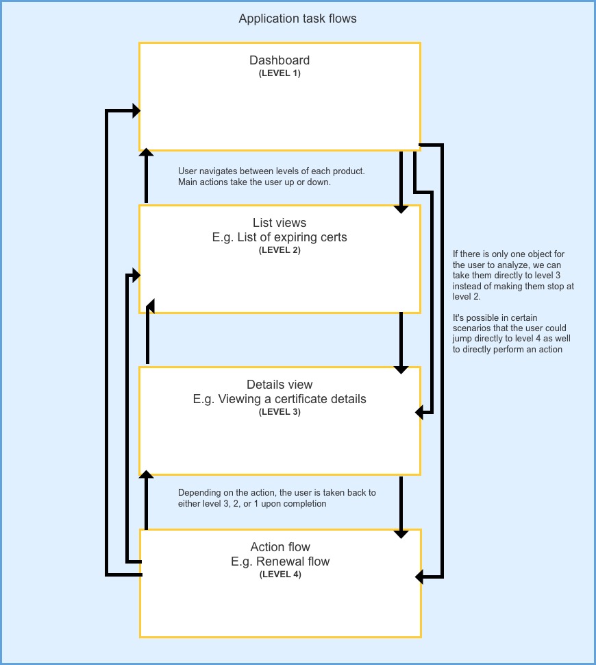
Here I’ve added a snapshot of the formalized task based workflow. It was broken into 4 major levels which our applications across all channels (retail – SMB – enterprise) could all leverage.
Wireframes and prototype
Once we had an idea of the architecture, and general direction of the application we went through some iterations of wireframes, internal reviews and hallway testing. The goal was to have some assets which we could test with users, so we also built a prototype for the test.
Click the screenshot below to view the basic prototype used for testing. Click around, most of the menus and drop downs open, though some of the actual test functionality isn’t included here.
Password: final-specs

Workflow and usability testing
Once we finished up the prototypes we were ready to start user testing. The UX research team helped facilitate this testing. This was tested on our retail and enterprise platforms, here I will focus on enterprise.
Participant overview
- Tested Small and medium businesses, and enterprises
- Tested with 8 participants
- Org size ranged from 1000 – 10,000 people
- Number of certificates managed ranged from 25 – 1000
- All were users of either MPKI or CIC
Study tasks
This study compared the new style guide to one of our existing enterprise products that the guide was intended to replace. You can read more about that project here.
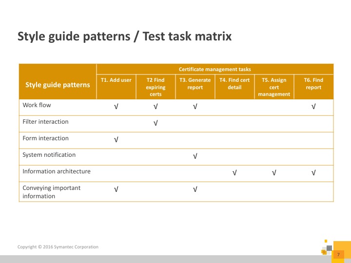
Here’s an overview of the tasks and our testing goals for each one:
Study findings
- Conveying important information – Participants appreciated the task based design, and thought it would help their work
- All participants were able to easily find the tasks from the dashboard
- Information architecture – 100% completion rate for T6 and higher overall completion rate for IA related tasks (picking up report from dashboard)
- Workflow – Breadcrumb based navigation paradigm was followed well
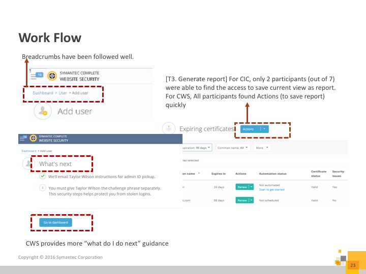
“It’s easier to find what I’m looking for [with this dashboard]”
-User testing participant
After this round of user testing we started working with engineering to ensure that our designs were achievable. The idea was that engineering would design re-usable components which all our channels could leverage. A feature that never got finished was adding code snippets to the style guide.
Final recommendations
After the user testing we performed some internal reviews and iterations to the designs. We also engaged the visual designers to come up with designs which we ran through a second user test. Further details on that test are in the PKI overhaul project.
Once we had the results from the second test, we finalized all the design recommendations and posted the style guide on our internal UX website.
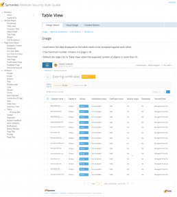
One of the major concepts which allowed us to build the style guide in a scalable way was the “Flexible grid view”. The overall idea, which I came up with and drove was that the grid (aka list / table) views could dynamically change the way they display the information based on a threshold for the amount of data being shown.
Click the image below to view the full flexible grid specification.
Password: final-specs
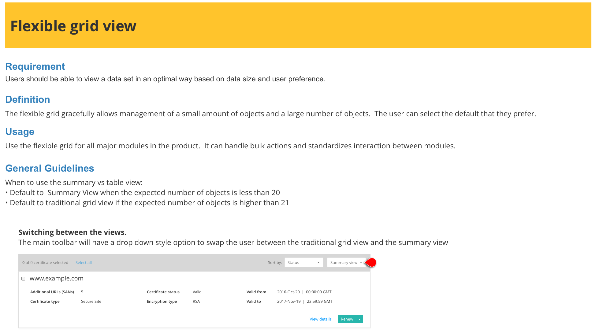
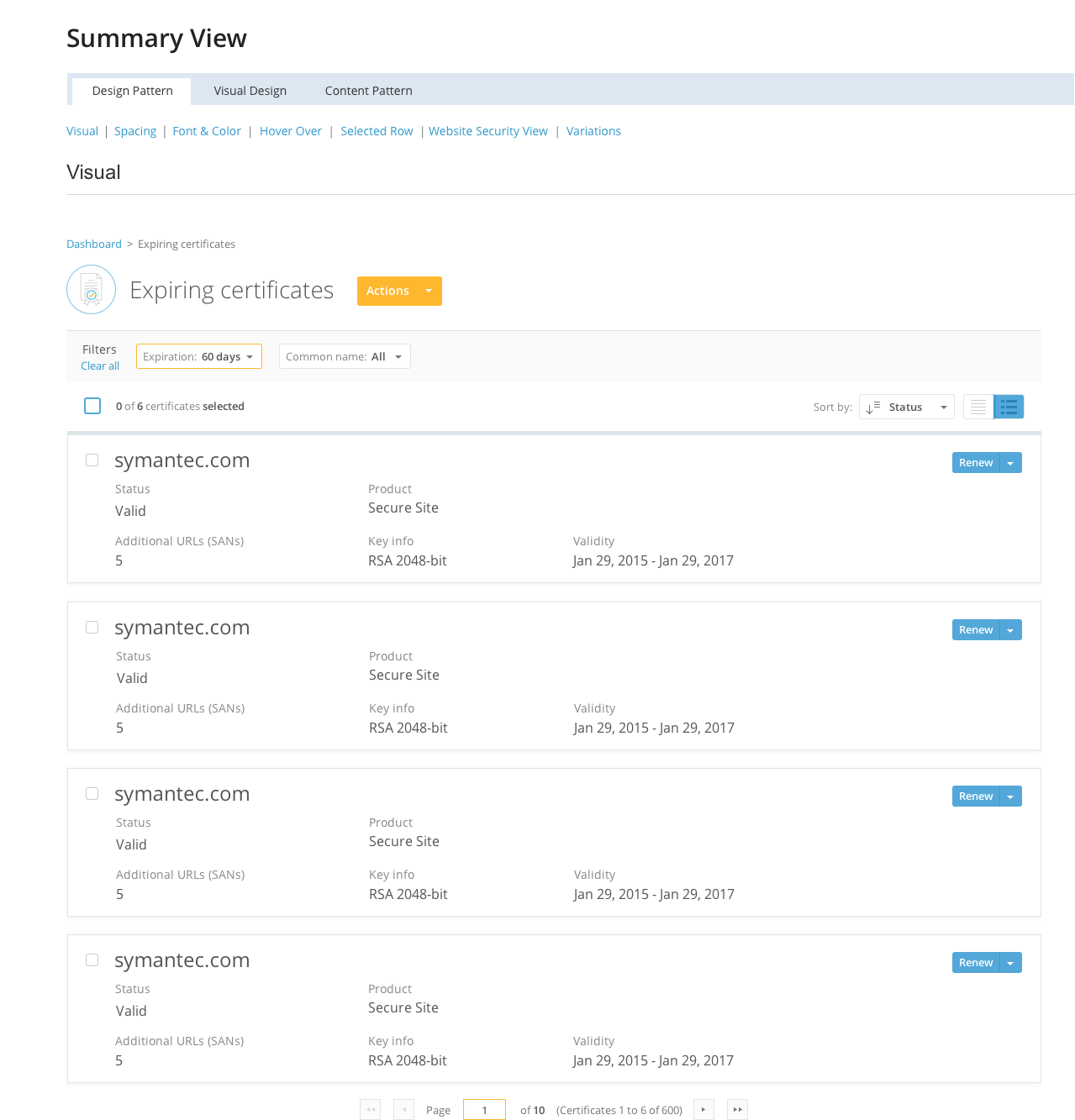
I included the flexible table spec here for explanatory purposes. When we built the final version of the guide we split the “summary view” (view for smaller amounts of data) and the “table view” into separate specifications.
Click the image below to see the full summary view specification in the final style guide.
Password: final-specs
Implementation
The first product to receive the updated style guide was CWS. As the product was being developed using the new style guide, we were in constant communication with the UI development team. Each designer was responsible for ensuring their contribution to the guide was properly implemented by engineering. Since I was the project lead and most familiar with the product receiving the style guide I did a lot of the heavy lifting for QA-ing the new guide.
It was an interesting situation since we were developing a new product with a new style guide (with an engineering team overseas). Let’s just say there were many defects and enhancements filed!