New feature setup process enhancements
Project boxscore
Position Did the all the design and experience work including visuals. Worked with research team to collect feedback from users.
Duration 2 months
Tools


Rundown
Project overview
I was assigned to lead the UX for the next generation of products at DigiCert. One of the scrum teams I was assigned to was focused on IOT device certificate management. This was one of the first projects I did for this product, where I pushed the team to enhance the initial setup process, which was confusing.
Initial discovery
When I was assigned to this project, I performed a high level initial evaluation. The most noticeable finding was that the product had a general lack of guidance and help. One especially poor process was the setup process which needed to be performed before getting started.
Since every customer would have to use the setup process, I did a deeper dive into that part of the application. I didn’t have the opportunity to perform customer research on the original implementation, so I did a heuristic analysis of the setup process.
Heuristic evaluation findings: High severity
As mentioned above the lack of help and explanations was a huge issue, the other issues stemmed mainly from a lack of clear direction and the user not having all the information they needed at the right time to make the best decisions.
- Visibility of system status
- Match between system and real world
- Recognition rather than recall
- Help and documentation
User flows
The next step in my process was to figure out how to optimize the workflows to address the visibility of system status and recognition rather than recall issues.
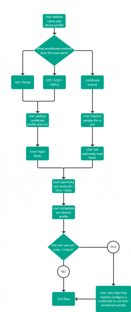
Design proposal
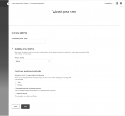
Based on the requirements, and the heuristic analysis results I put together some design recommendations which called for a wizard to be used to connect the setup steps together. This would help the user understand what needed to be done and streamline the process.
Final spec handoff
I collaborated with the product team including the product manager and front / back end engineers to finalize the design. I handed off the designs to the team and they were developed and deployed into production.
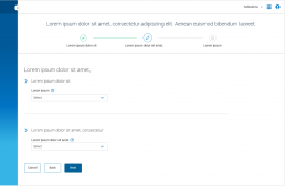
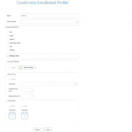
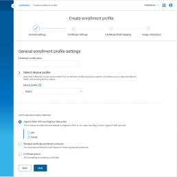
Below is a comparison of the original create enrollment profile vs the first step in the newly recommended wizard.
Benchmarking research
Before I started designing for this project, I let the research team know that we would want to validate these designs through a benchmarking study.
Goals
- Understand the benefits of the new design
- Validate the usability of the new design
Process
The research team tested people on the old design before we made changes to the production environment, and then again after we updated the workflow. Participants were given 4 tasks to complete with minimal guidance on how to do so.
Results
23
56
| Tasks | Old design | Proposed design |
|---|---|---|
| Task 1 | 100% | 83% |
| Task 2 | 100% | 100% |
| Task 3 | 13% | 100% |
| Task 4 | 100% | 100% |
| Overall | 78% | 96% |
Research breakdown
Why did the new design perform so poorly on task 1?
One of the issues highlighted above in the heuristic evaluation was recognition rather than recall. This issue was stemming from selections where the user was being asked to make. The user was forced to make this choice based only on the name of several objects, and would have to either open a new tab, to go and double check the details of that object, or have to remember them.
In an attempt to address this, the new design allowed a user to view a snapshot of the details of the object once they selected it. The interaction however proved to be a bit confusing.

Design recommendation to make expander easier to understand
To help mitigate this issue, I proposed a design which was in a more contextual place, and had a more clear call to action.
